‘Not every presentation should be like Steve Jobs’ ’. With the recent slew of text-heavy presentations that put people to sleep, it’s no wonder why Steve Jobs’ presentation to unveil the iPhone in 2007 gave audiences a breath of fresh air. The highly visual style of presentations has grown in appeal to many presenters from all walks of life. But should we all present like Steve Jobs?
Let us put this in context – If you had to speak to your company’s CEO and a five-year-old child about a topic, would you use the same tone towards both? Similarly, different presentation settings require different styles, and different audiences require different ways of reaching out to them. This is why a Steve Jobs, TED-style presentation will not work in a boardroom and a text-heavy slide deck may not succeed at a conference. Hence, presentations should be designed according to their contexts.
However, if there is one thing we can take away from Steve Jobs’ amazing presentation, it would be the use of visuals. Studies have shown that people tend to remember only 10% of the information presented in textual form 72 hours after exposure. That figure goes up to 65% when you add an image.
So how can we bring out our key messages using visuals better?
For the workshop organized by HUONE Singapore, HighSpark and Singapore Administrative Professionals (SAAP) for administrative professionals, we had the opportunity to share some tips to help participants better understand how key messages can be understood through the use of visuals.
Tip #1 – Use Photos That Connect Emotionally
Example: Education

Humans are wired to seek emotional connections. Using photographs with an action or with expressions will help you to tug at the heartstrings of the audience. Take the word “Education” for example. There are many ways to visualize this word and different imagery will evoke
different feelings. Instead of using an image with books and building blocks, you can put education in action by adding a photo of an educator teaching a child. Isn’t this much more impactful?
Tip #2 – Use of Visual Bullet Points
Before and after
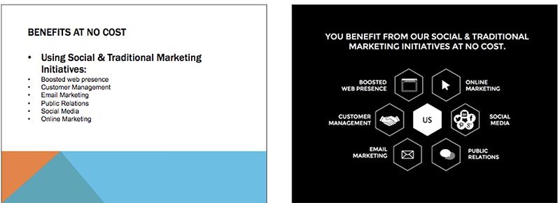
Bullet points aim to get key messages across as quick as a bullet. However, we can hasten the process of understanding by using icons. Icons can help the audience understand key points with fewer words, leaving more room for creativity and a plethora of ways to display the content.
Tip #3 – Use Images to Fill the Slide
Before and after

Gone are the days where images are copied and pasted onto slides as they are. Filling up space on a slide is important to enhance the purpose of the image in bringing out key messages. Work with images that have simple backgrounds to make enlarging easy. Small changes like these can make a great impact.
In short, presentations are just like social functions. Similar to how one must master the art of dressing appropriately for the occasion, an effective presentation should be designed with the audience and context in mind. There is never a one-size-fits-all solution but with the right tools and training, one can better craft their story with professional and functional visuals.
The writer is the founder or HighSpark, Koh Kai Xin. After serving a range of clients, including Fortune 500 companies from various industries, the company started using its experience and skills to help cutting-edge organizations and individuals drive action through visual narratives by sharing best practices across industries.